Unstoppable Domains: Streamlining Navigation for NFT Domains

Crypto Wallet App
〰️
UX Research
〰️
UX/UI Design
〰️
Prototyping
〰️
Mockups
〰️
Usability Testing
〰️
Crypto Wallet App 〰️ UX Research 〰️ UX/UI Design 〰️ Prototyping 〰️ Mockups 〰️ Usability Testing 〰️
Rethinking Navigation for Web3 Domains
Simplifying Navigation for Unstoppable Domains
Unstoppable Domains is a digital company that issues decentralized domains to their customers. The team asked me to take on a week long design challenge with the goal of creating a more natural and simplified navigation flow that highlights the core functionality of the app.
Design Process
Download the app and test out the features that it offers.
Conduct user testing and create a journey map that highlights the current flow.
Create low and high-fidelity prototypes with the help of user feedback.
Navigation Confusion for New Users
Users who download the mobile app are not sure whether or not they are using the official Unstoppable Domains mobile app, as the web app looks different.
Upon downloading the mobile app, users do not know where to start or how to properly navigate to take full advantage of the utility offered by the app.
Exploring the Current Experience
Upon being tasked to create an improved navigation flow for the Unstoppable Domains app, I proceeded to download the app and test out the features that it offers with the help of a couple domains acquired by a promo code kindly provided by the team. Moreover, I brought on two users who are in the crypto space to test out the app and hear about their experience using it and recorded their responses.
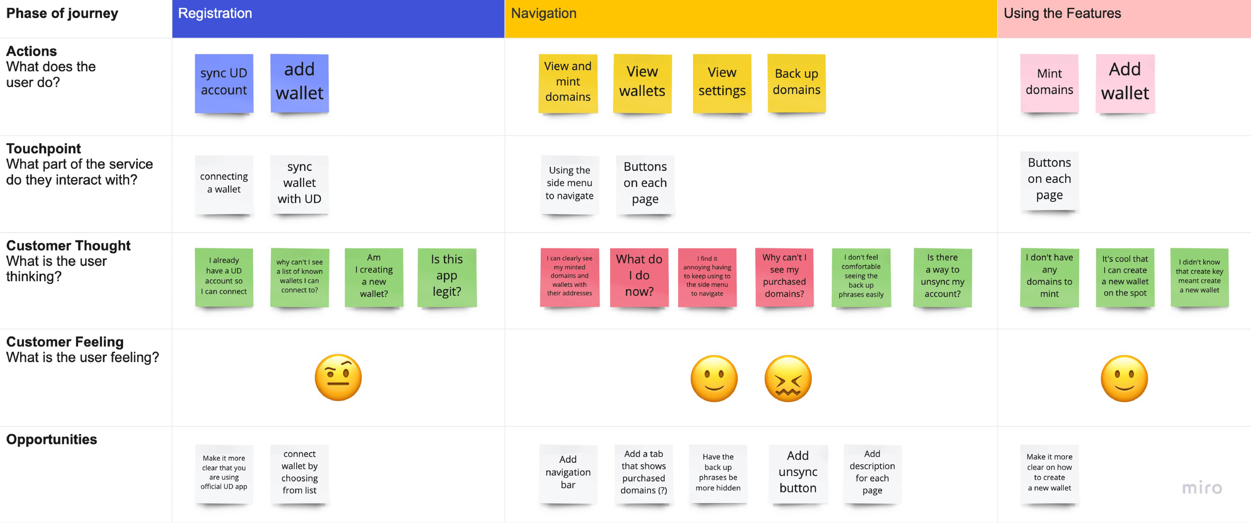
Testing New Navigation Flows
After gathering enough data, a low-fidelity prototype was created to explore navigation flows which focus on the core functionality of the app. I proceeded to test out the new flow on the same group of users.
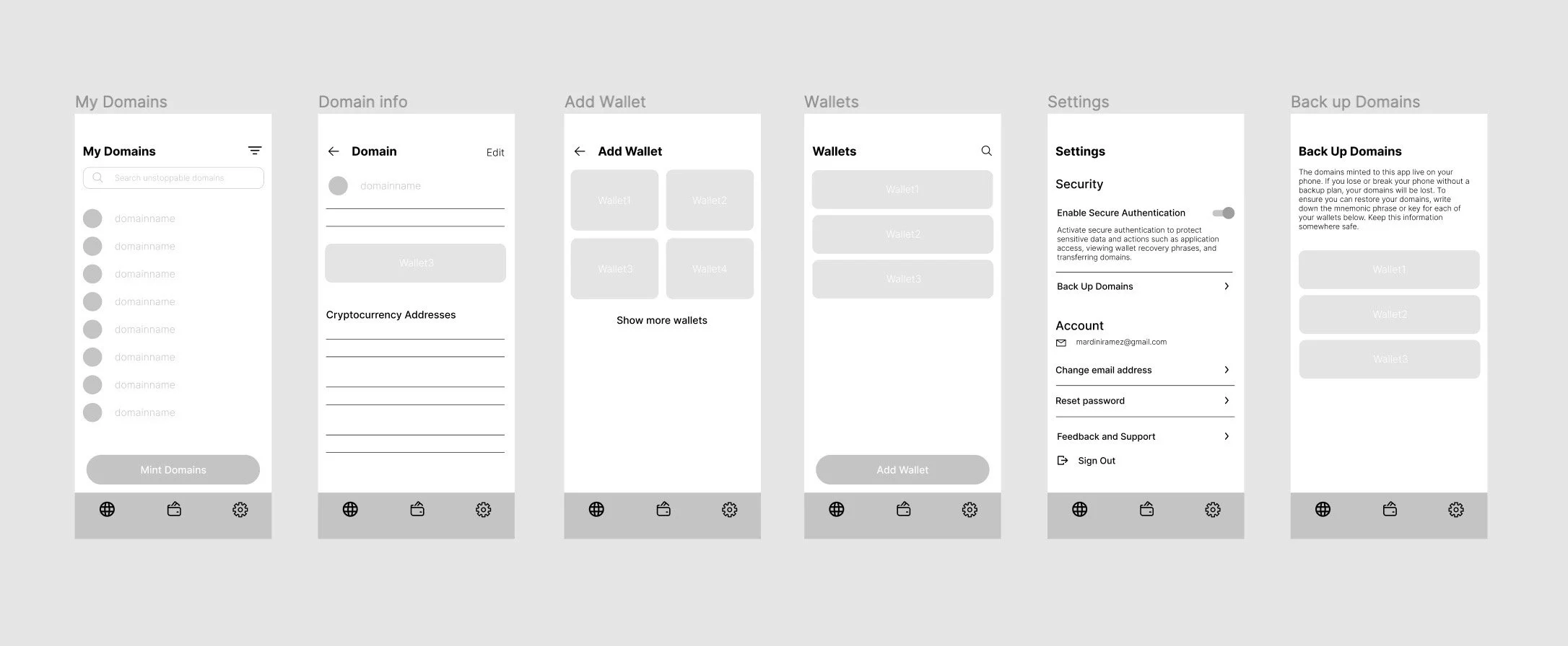
Final Design
For the last steps, I iterated on the designs based on the user feedback for the high-fidelity mockups and prototype, followed by a second round of testing that provided more feedback on the UI.
Establishing Trust on First Launch
When opening the app, users are met with a statement that says “View and edit your domains and wallets with the official Unstoppable Domains app.”, as well as a copyright notice at the bottom of the screen.

Clarifying the Wallet Setup
Users were unsure whether to create a new wallet or add an existing one because each wallet had to be named. To improve clarity, I mirrored the wallet list from the Unstoppable Domains website and added a clear option to create a new wallet.

Replacing the Side Menu With Bottom Navigation
One of the users’ notable issues was the side menu that has all the main pages. They found that it was tedious to navigate due to the need to open the side menu. Therefore, I created a navigation bar for a more natural user flow.

Securing Domain Backups
In regards to backing up domains, we felt that the backup phrases should be stored somewhere less conspicuous for safety reasons. I decided to add the feature in the settings tab.

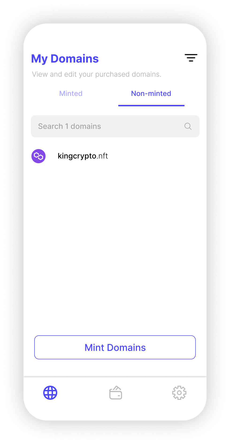
Clarifying the Domain Minting State
After purchasing my second domain, I waited for it to appear on the app only to realize that it won’t appear until I mint it on the website or the app. Therefore, I created a second Figma flow of the Domains page that shows the purchased non-minted domains on a separate tab to avoid possible confusion.