Fixing the booking Friction in On-Demand Home Services

User Research
〰️
Competitive Analysis
〰️
Prototyping
〰️
User Testing
〰️
Collaboration
〰️
Design System
〰️
App Redesign
〰️
Website Redesign
〰️
User Research 〰️ Competitive Analysis 〰️ Prototyping 〰️ User Testing 〰️ Collaboration 〰️ Design System 〰️ App Redesign 〰️ Website Redesign 〰️
Redesigning the booking experience for an on-demand cleaning platform that lets users schedule trusted cleaners in seconds.
After
Before
Previous Ezi booking flow
Ezi — On-Demand Home Services Platform
Ezi is an on-demand cleaning platform that connects users with trusted local cleaners. It enables quick booking through streamlined scheduling, transparent pricing, and secure online payments.
Users were dropping off before completing bookings.
The old Ezi booking form was long and clunky, especially on mobile. Users often dropped off, and since contact info was only collected at the end, they couldn’t follow up.
Make booking home services effortless.
The goal of the redesign was to simplify how customers book cleaning services—fewer steps, clearer info, and a smoother experience. The changes were all about reducing friction and making the app feel more reliable and easy to use.
My Roles
UX Researcher
UX/UI Designer
Deliverables
UI redesign
Improved booking process
Custom design system
Team
Product Manager
Lead Developer
Understanding where users drop off
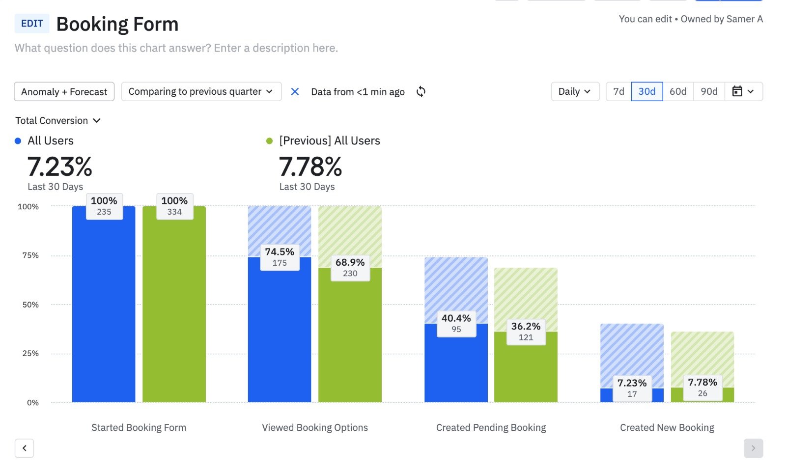
Only 7.23% of Users Completed the Booking
This chart presents a funnel analysis of user interactions with the Ezi booking form over the last 30 days, compared to the previous quarter. It tracks the conversion rate of users through various stages of the booking process, from starting the form to creating a new booking.
7.23% of users who start the booking form complete it by creating a new booking. I aimed to boost this conversion rate and encourage more users to finalize their bookings.
What Users Told Me
I ran surveys and interviews with customers to uncover key issues. They needed a shorter booking flow and transparent pricing. These insights shaped my design approach.
60%
Reported that they found it tedious to navigate the clunky booking flow.
45%
Felt that the booking process was too long.
50%
Reported that they’d like to have dynamic pricing as users book a service.
Simplify booking decisions and increase trust through transparency.

Wireframe mockups
Refining the Booking Experience
The focus was on simplifying the booking process and making key information, like service options and pricing, easily accessible.
Users found it easier to compare services and appreciated seeing prices up front—it made booking feel more straightforward. Some were confused by the time slot selection, so I reorganized the layout to highlight available times and added quick tips. Each round of testing helped refine the flow before moving to high-fidelity designs.
Validating Usability Feedback with AI
To validate usability testing feedback, I used Attention Insight’s AI eye-tracking tool to analyze how users interacted with the booking form. Several users said they were unsure if their selections affected the total price.
The heatmaps showed most attention on the pricing summary and availability, while key inputs like cleaning type and room selection were often missed. This confirmed the need for better visual hierarchy. I adjusted the layout and styling to make service selection more prominent and guide users more clearly through the flow.

Attention Map

Focus Map
The Redesign
Redesigning the Stepper to Be Mobile-friendly
The original stepper wasn’t optimized for mobile, making it hard for users to follow their progress. I redesigned it to be:
Vertical on mobile for better readability and touch navigation
Horizontal on desktop to use screen space efficiently
Clear and numbered so users always know where they are in the process
This responsive layout made the booking flow easier to follow and reduced user confusion—especially on smaller screens.
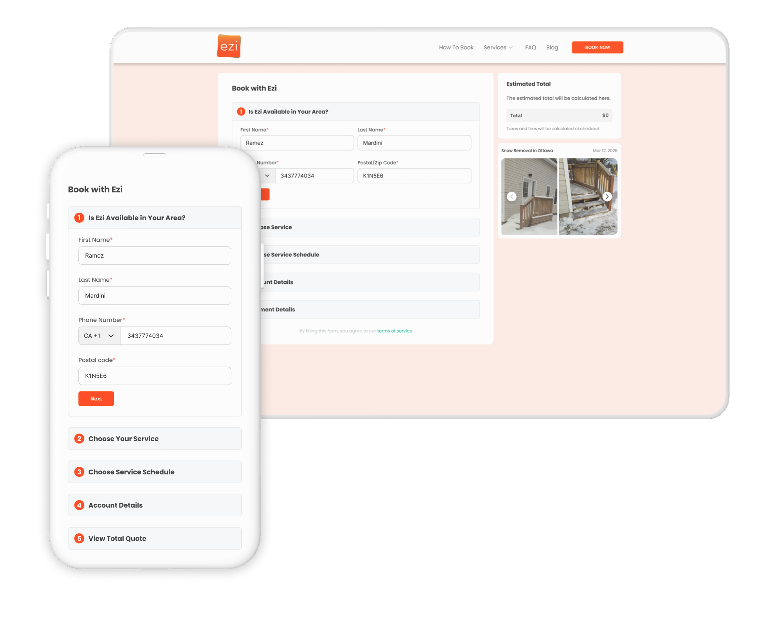

Capturing User Information
To reduce drop-offs and capture leads, I added a simple contact step at the start of the booking flow.
Users now enter their name, and phone number, and their postal code upfront. This lets us:
Re-engage users who don’t complete the form
Send confirmations and follow-ups
Personalize the experience from the start
It’s quick, unobtrusive, and improved our ability to connect with potential customers.
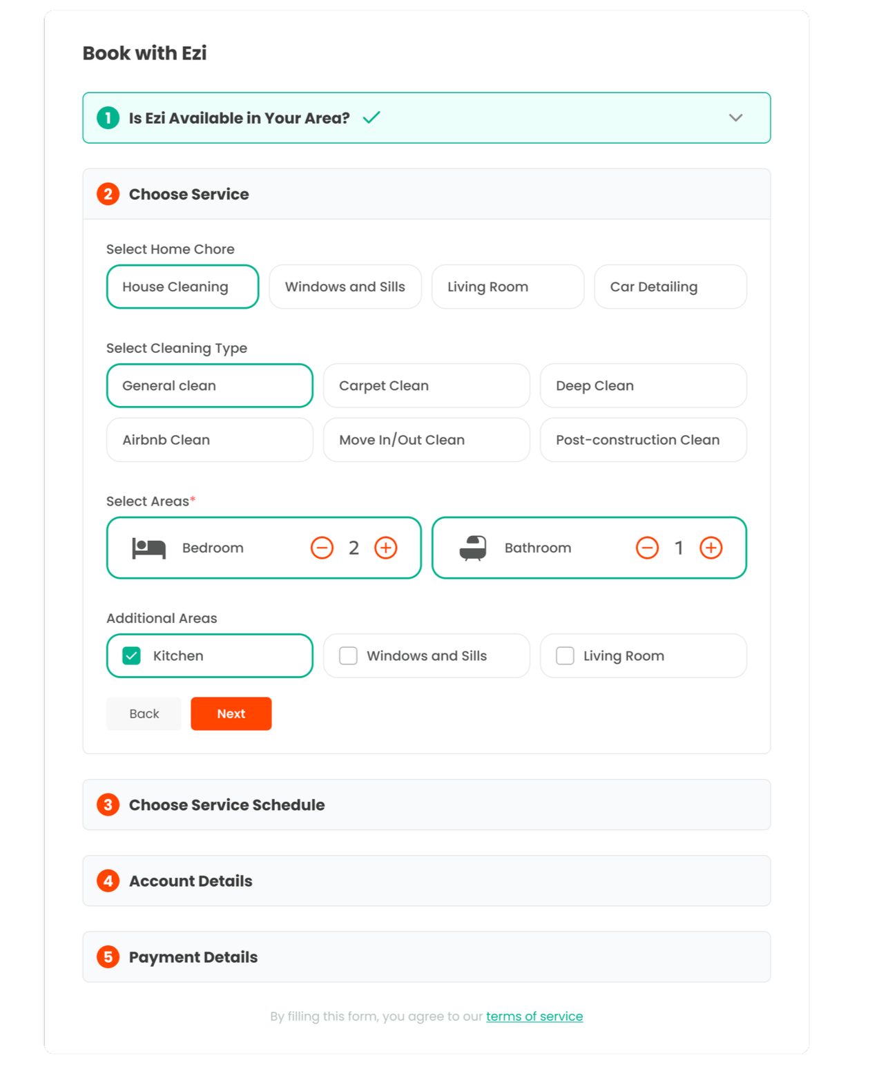
Combining 3 Steps Into One Streamlined Section
To simplify and shorten the booking flow, I merged three separate steps—chore type, cleaning type, and areas that need cleaning—into a single, cohesive section, with each chore type having its own respective service selections. This helped:
Reduce the number of screens users had to go through
Keep related inputs grouped together for faster decision-making
Make the process feel shorter and more intuitive
The new layout makes it easier for users to select all core service details in one place, speeding up the booking experience.

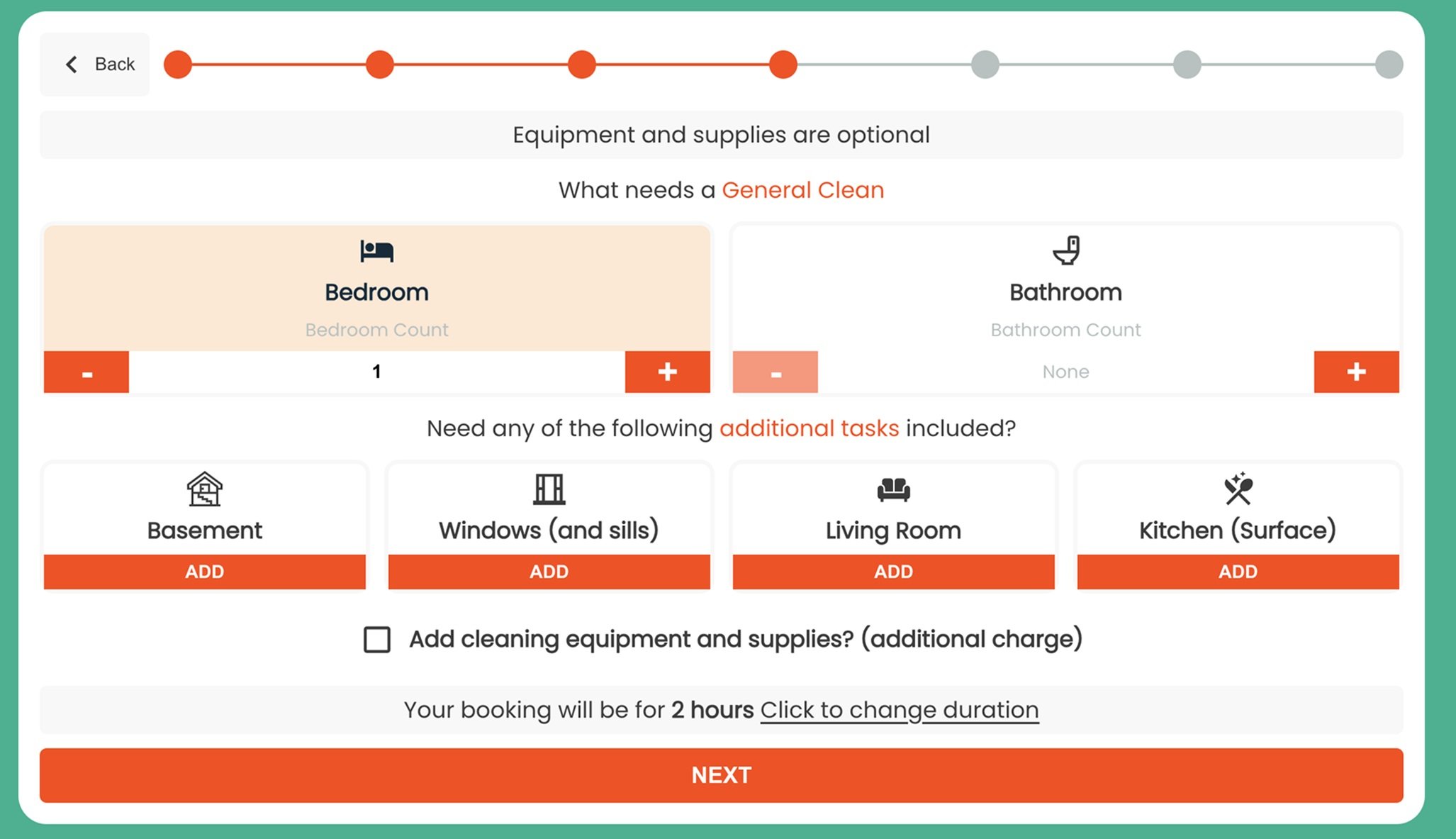
Dynamic Pricing
As users choose services and areas to be cleaned, the total cost updates in real time on both web and mobile. This dynamic pricing approach:
Shows the cost of each selection instantly
Builds transparency and trust with users
Helps users make informed decisions without surprises at checkout
The estimated total is always visible, making the experience clear, responsive, and user-friendly.
The Outcome
22%
Increase in completed bookings — fewer users dropped off before checkout.
35%
Reduction in time to complete a booking.
40%
fewer support requests related to booking issues.
85%
Positive user feedback in post-launch surveys, saying the new flow felt clearer and more transparent.